Lume
Lume is a modern skincare brand designed to feel soft and effortlessly desirable.
The goal of this project was to create a visual identity that feels calm and refined, while still standing out in a highly saturated beauty market.
Instead of following typical “clean beauty” clichés, the focus was on creating something more distinctive - a brand that feels feminine and quietly confident.
Lume
Lume is a modern skincare brand designed to feel soft and effortlessly desirable.
The goal of this project was to create a visual identity that feels calm and refined, while still standing out in a highly saturated beauty market.
Instead of following typical “clean beauty” clichés, the focus was on creating something more distinctive - a brand that feels feminine and quietly confident.
The concept behind Lume was built around softness and everyday rituals of self-care.
The direction combines minimal structure with subtle sensuality, creating a balance between clean aesthetics and emotional appeal.
The aim was to design a brand that not only looks premium, but also feels inviting and desirable.
CONCEPT & DIRECTION
CONCEPT & DIRECTION
The concept behind Lume was built around softness and everyday rituals of self-care.
The direction combines minimal structure with subtle sensuality, creating a balance between clean aesthetics and emotional appeal.
The aim was to design a brand that not only looks premium, but also feels inviting and desirable.
The logo is soft and fluid, adding a sense of personality without overpowering the overall minimal direction.
Typography was selected to feel elegant and modern, while still maintaining warmth and approachability.
The color palette plays a key role in shaping the brand. Muted pinks, warm neutrals and soft contrasts create a cohesive, elevated look that feels both feminine and contemporary.
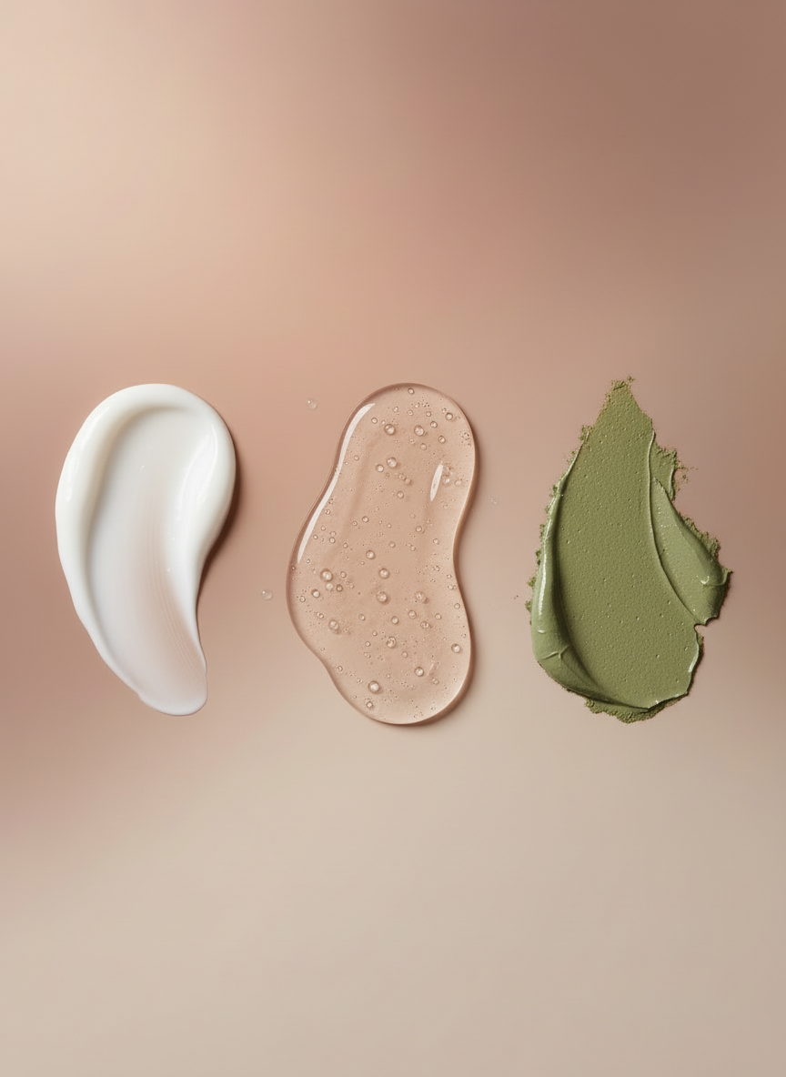
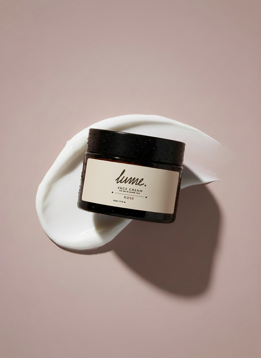
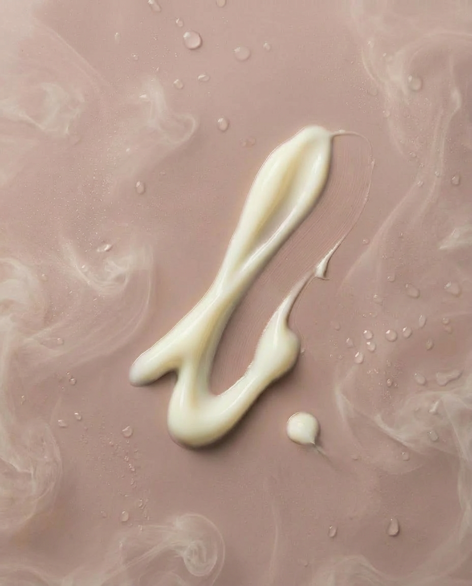
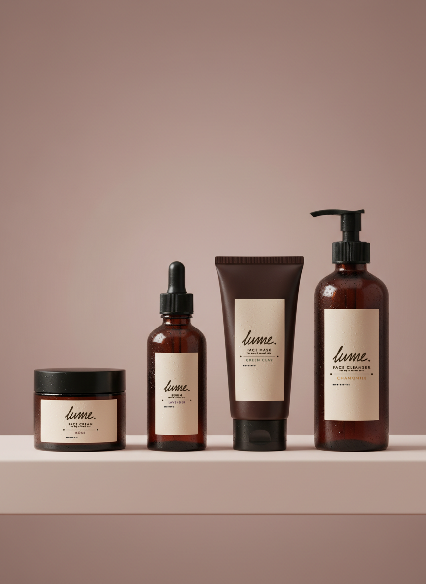
Product visuals were designed to enhance the sensory aspect of the brand: smooth textures, soft lighting and subtle details that highlight the feeling of skincare as a ritual.
VISUAL IDENTITY
VISUAL IDENTITY
The logo is soft and fluid, adding a sense of personality without overpowering the overall minimal direction.
Typography was selected to feel elegant and modern, while still maintaining warmth and approachability.
The color palette plays a key role in shaping the brand. Muted pinks, warm neutrals and soft contrasts create a cohesive, elevated look that feels both feminine and contemporary.
Product visuals were designed to enhance the sensory aspect of the brand: smooth textures, soft lighting and subtle details that highlight the feeling of skincare as a ritual.

The final identity feels cohesive and emotionally engaging.
Lume stands out by creating a soft, memorable presence that attracts attention in a subtle way.
Because in beauty, it’s not just about how a product looks, it’s about how it makes you feel.
OUTCOME
OUTCOME
The final identity feels cohesive and emotionally engaging.
Lume stands out by creating a soft, memorable presence that attracts attention in a subtle way.

This project reflects my approach to branding: creating identities that go beyond aesthetics and tap into how a brand is experienced visually and emotionally.
Because in beauty, it’s not just about how a product looks, it’s about how it makes you feel.
This project reflects my approach to branding: creating identities that go beyond aesthetics and tap into how a brand is experienced visually and emotionally.