North Nails
North Nails is a modern nail studio brand designed to feel clean and quietly premium.
The goal of this project was to create a visual identity that elevates the everyday salon experience. Making it feel more polished and high-end without becoming overly decorative.
North Nails
North Nails is a modern nail studio brand designed to feel clean and quietly premium.
The goal of this project was to create a visual identity that elevates the everyday salon experience. Making it feel more polished and high-end without becoming overly decorative.
The concept is rooted in simplicity and clarity.
Instead of following typical beauty aesthetics filled with trends and heavy decoration, the brand focuses on restraint, allowing space, balance and subtle details to define the experience.
The direction leans into a more mature and minimal look, positioning the studio as calm and professional.
CONCEPT & DIRECTION
CONCEPT & DIRECTION
The concept is rooted in simplicity and clarity.
Instead of following typical beauty aesthetics filled with trends and heavy decoration, the brand focuses on restraint, allowing space, balance and subtle details to define the experience.
The direction leans into a more mature and minimal look, positioning the studio as calm and professional.

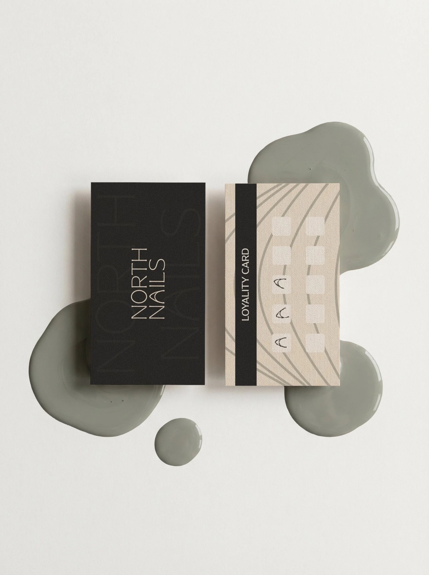
The logo is clean and structured, designed to feel timeless rather than trendy.
Typography plays a key role in the identity. It’s minimal, elegant and easy to recognize across all applications.
The color palette combines soft neutrals with muted cool tones, creating a sense of calm while still feeling modern.
Supporting elements, like soft organic shapes add just enough visual interest without overpowering the simplicity of the brand.
VISUAL IDENTITY
VISUAL IDENTITY
The logo is clean and structured, designed to feel timeless rather than trendy.
Typography plays a key role in the identity. It’s minimal, elegant and easy to recognize across all applications.
The color palette combines soft neutrals with muted cool tones, creating a sense of calm while still feeling modern.
Supporting elements, like soft organic shapes add just enough visual interest without overpowering the simplicity of the brand.

The final result is a brand that feels elevated and professional.
North Nails stands out by creating a space that feels clean, modern and intentionally designed.
A minimal, quietly premium identity designed to elevate the salon experience.
OUTCOME
OUTCOME
The final result is a brand that feels elevated and professional.
North Nails stands out by creating a space that feels clean, modern and intentionally designed.

This project reflects my approach to branding: creating identities that feel premium and intentional, while still being simple and easy to use across real business touchpoints.
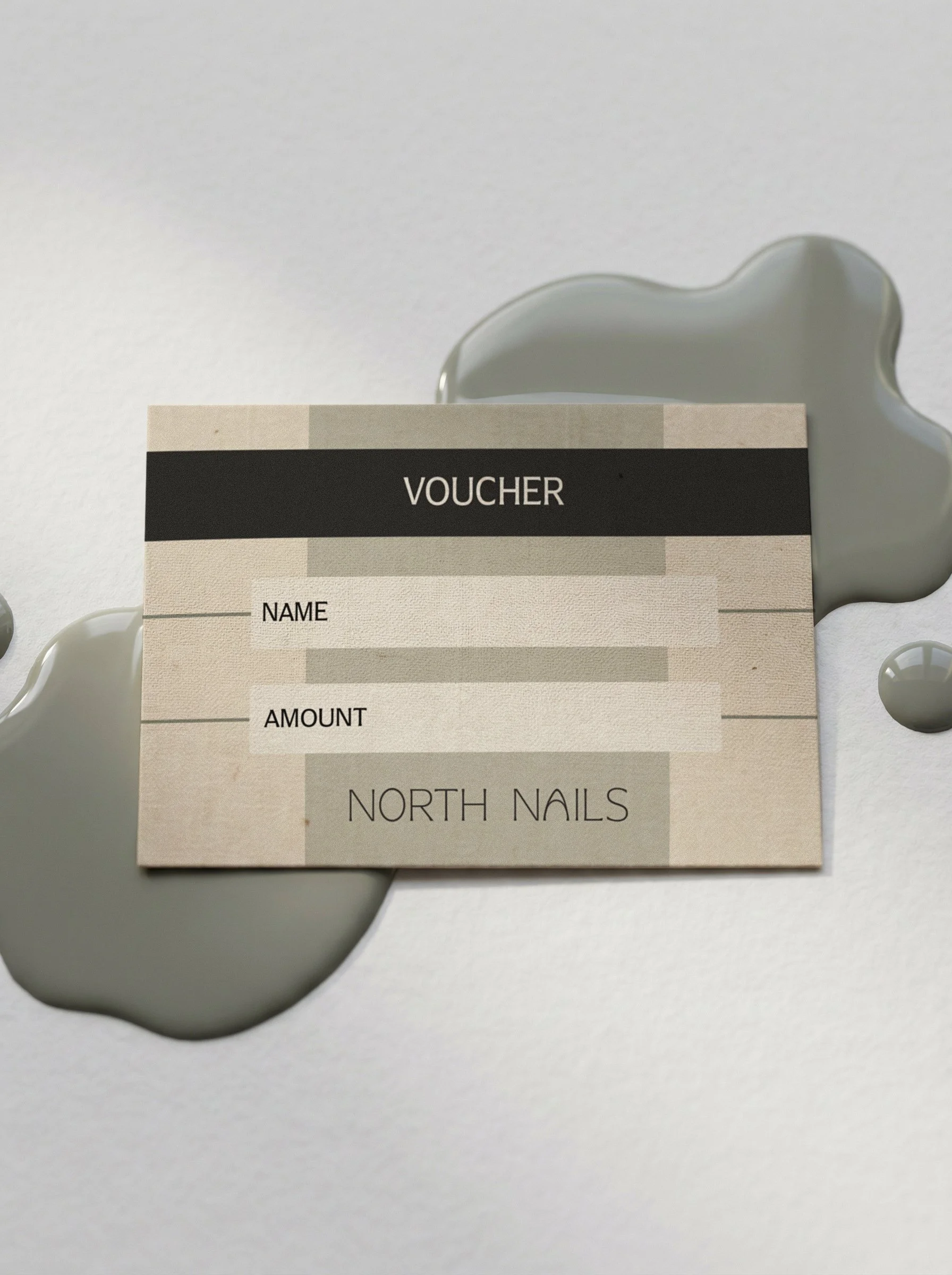
A minimal, quietly premium identity designed to elevate the salon experience.
This project reflects my approach to branding: creating identities that feel premium and intentional, while still being simple and easy to use across real business touchpoints.