Shared Ground
Shared Ground is a community-focused brand built around connection, movement and shared experiences.
The goal of this project was to create a visual identity that feels energetic and rooted in real human interaction.
Instead of focusing purely on aesthetics, the brand was designed to reflect a feeling: being outside, being active and being part of something bigger.
Shared Ground
Shared Ground is a community-focused brand built around connection, movement and shared experiences.
The goal of this project was to create a visual identity that feels energetic and rooted in real human interaction.
Instead of focusing purely on aesthetics, the brand was designed to reflect a feeling: being outside, being active and being part of something bigger.
The concept is built around the idea of “shared space” both physically and emotionally.
It represents people coming together, moving together and creating experiences in the same environment.
The direction focuses on authenticity and a sense of belonging, avoiding anything that feels too corporate or distant.
CONCEPT & DIRECTION
CONCEPT & DIRECTION
The concept is built around the idea of “shared space” both physically and emotionally.
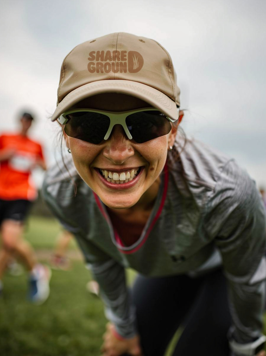
IIt represents people coming together, moving together and creating experiences in the same environment.
The direction focuses on authenticity and a sense of belonging, avoiding anything that feels too corporate or distant.

The logo is bold and friendly, designed to be instantly recognizable and adaptable across different contexts (from digital content to real-life events).
Typography is strong and slightly playful, adding personality while keeping the brand clear and easy to read.
The color palette combines natural greens with warmer tones, creating a grounded yet energetic feel. This balance reflects both the outdoor aspect and the human, social side of the brand.
Visual elements and layouts are intentionally dynamic, supporting the idea of movement and interaction rather than static perfection.
VISUAL IDENTITY
VISUAL IDENTITY
The logo is bold and friendly, designed to be instantly recognizable and adaptable across different contexts (from digital content to real-life events).
Typography is strong and slightly playful, adding personality while keeping the brand clear and easy to read.
The color palette combines natural greens with warmer tones, creating a grounded yet energetic feel. This balance reflects both the outdoor aspect and the human, social side of the brand.
Visual elements and layouts are intentionally dynamic, supporting the idea of movement and interaction rather than static perfection.

The final identity feels alive and social.
Shared Ground stands out through its energy and authenticity, creating a brand that people don’t just recognize, but want to be part of.
Because strong brands don’t just exist visually, they create experiences.
OUTCOME
OUTCOME
The final identity feels alive and social.
Shared Ground stands out through its energy and authenticity, creating a brand that people don’t just recognize, but want to be part of.

This project reflects my approach to branding: building identities that capture not just how a brand looks, but how it behaves and connects with people.

Because strong brands don’t just exist visually, they create experiences.
This project reflects my approach to branding: building identities that capture not just how a brand looks, but how it behaves and connects with people.