Stilla
is a modern wellness brand built around the idea of slowing down and creating space in a world that constantly demands more.
The intention behind this project was to move away from overly decorative, trend-based wellness branding and instead create something more grounded, refined and emotionally clear.
Stilla
is a modern wellness brand built around the idea of slowing down and creating space in a world that constantly demands more.
The intention behind this project was to move away from overly decorative, trend-based wellness branding and instead create something more grounded, refined and emotionally clear.
The concept was inspired by stillness, water and small everyday rituals that allow people to reconnect with themselves.
Instead of relying on obvious wellness clichés, the focus was placed on subtle visual cues that communicate calm in a more sophisticated way.
The goal was to create a brand that doesn’t overwhelm, but instead invites the viewer to pause.
CONCEPT & DIRECTION
CONCEPT & DIRECTION
The concept was inspired by stillness, water and small everyday rituals that allow people to reconnect with themselves.
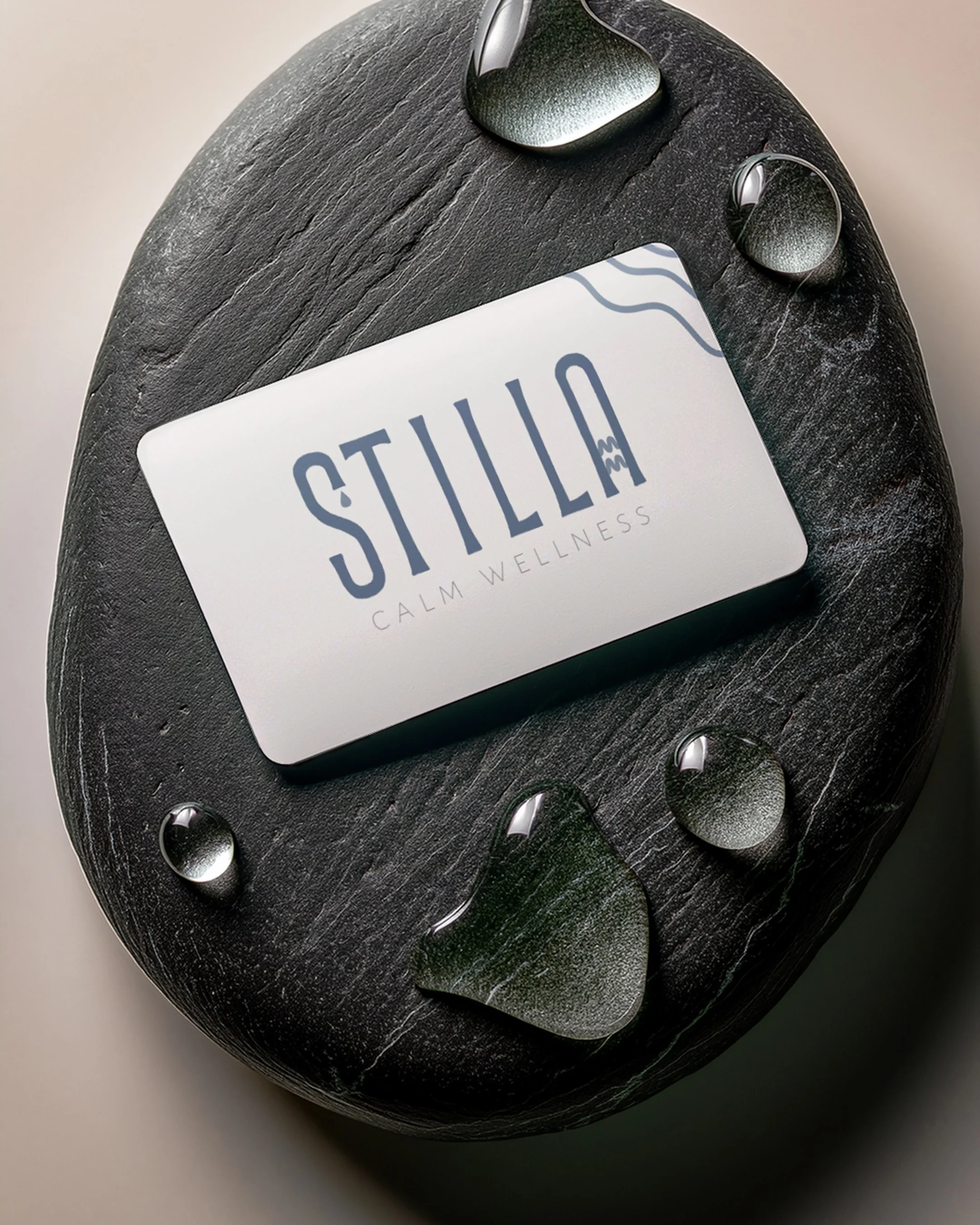
Instead of relying on obvious wellness clichés, the focus was placed on subtle visual cues that communicate calm in a more sophisticated way.
The goal was to create a brand that doesn’t overwhelm, but instead invites the viewer to pause.

The logo system explores minimal, fluid forms including a single drop and soft wave-like elements. These details act as quiet symbols of movement and presence.
Typography was chosen to balance softness with structure. Clean, elegant letterforms create a sense of clarity and trust, while still feeling modern and approachable.
The color palette is muted and grounded, designed to evoke calm without becoming flat or generic. Subtle contrast keeps the brand visually interesting while maintaining a cohesive and refined feel.
VISUAL IDENTITY
VISUAL IDENTITY
The logo system explores minimal, fluid forms including a single drop and soft wave-like elements. These details act as quiet symbols of movement and presence.
Typography was chosen to balance softness with structure. Clean, elegant letterforms create a sense of clarity and trust, while still feeling modern and approachable.
The color palette is muted and grounded, designed to evoke calm without becoming flat or generic. Subtle contrast keeps the brand visually interesting while maintaining a cohesive and refined feel.

The final identity feels calm and intentional without losing personality.
STILLA doesn’t try to compete for attention in a loud way. Instead, it creates a different kind of presence. One that feels considered, elevated and emotionally aligned with its audience.
Because strong brands aren’t just seen, they’re experienced.
OUTCOME
OUTCOME
The final identity feels calm and intentional without losing personality.
STILLA doesn’t try to compete for attention in a loud way. Instead, it creates a different kind of presence. One that feels considered, elevated and emotionally aligned with its audience.

This project reflects my approach to branding: creating identities that go beyond aesthetics and focus on how a brand makes people feel.

Because strong brands aren’t just seen, they’re experienced.
This project reflects my approach to branding: creating identities that go beyond aesthetics and focus on how a brand makes people feel.