Yoga for you
Yoga for you is a modern yoga brand created to feel personal, welcoming and grounded in real connection rather than perfection.
The goal of this project was to move away from overly polished, generic yoga aesthetics and create a brand that feels calm, but still human and approachable.
Instead of positioning yoga as something aspirational and distant, the focus was on making it feel accessible. Something that fits into everyday life.
Yoga for you
Yoga for you is
a modern yoga brand created to feel personal, welcoming and grounded in real connection rather than perfection.
The goal of this project was to move away from overly polished, generic yoga aesthetics and create a brand that feels calm, but still human and approachable.
Instead of positioning yoga as something aspirational and distant, the focus was
on making it feel accessible. Something that fits into everyday life.
The concept was built around the idea of balance and simplicity.
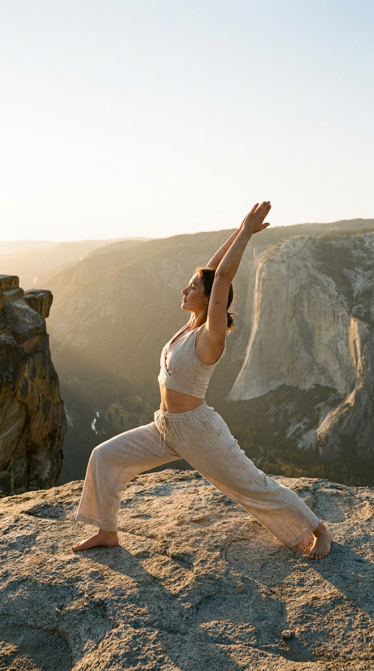
The visual direction explores soft forms, natural movement and a sense of ease, reflecting the experience of yoga itself rather than relying on literal imagery.
The aim was to create a brand that feels calm without being empty, and minimal, without losing warmth.
CONCEPT & DIRECTION
CONCEPT & DIRECTION
The concept was built around the idea
of balance and simplicity.
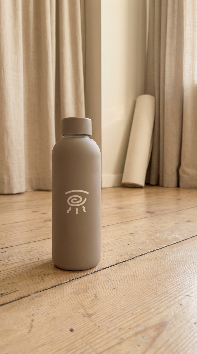
The visual direction explores soft forms, natural movement and a sense of ease, reflecting
the experience of yoga itself rather than relying on literal imagery.
The aim was to create
a brand that feels calm without being empty, and minimal, without losing warmth.
The logo uses fluid, organic shapes inspired by movement and breath. It’s intentionally simple, allowing it to feel timeless and adaptable across different touchpoints.
Typography balances clarity and softness. It’s clean enough to feel modern, but not overly rigid.
The color palette was designed to feel grounded and calming, using muted tones that create a sense of stability while still feeling fresh and contemporary.
VISUAL IDENTITY
VISUAL IDENTITY
The logo uses fluid, organic shapes inspired by movement and breath. It’s intentionally simple, allowing it to feel timeless and adaptable across different touchpoints.
Typography balances clarity and softness. It’s clean enough to feel modern, but not overly rigid.
The color palette was designed to feel grounded and calming, using muted tones that create a sense of stability while still feeling fresh and contemporary.

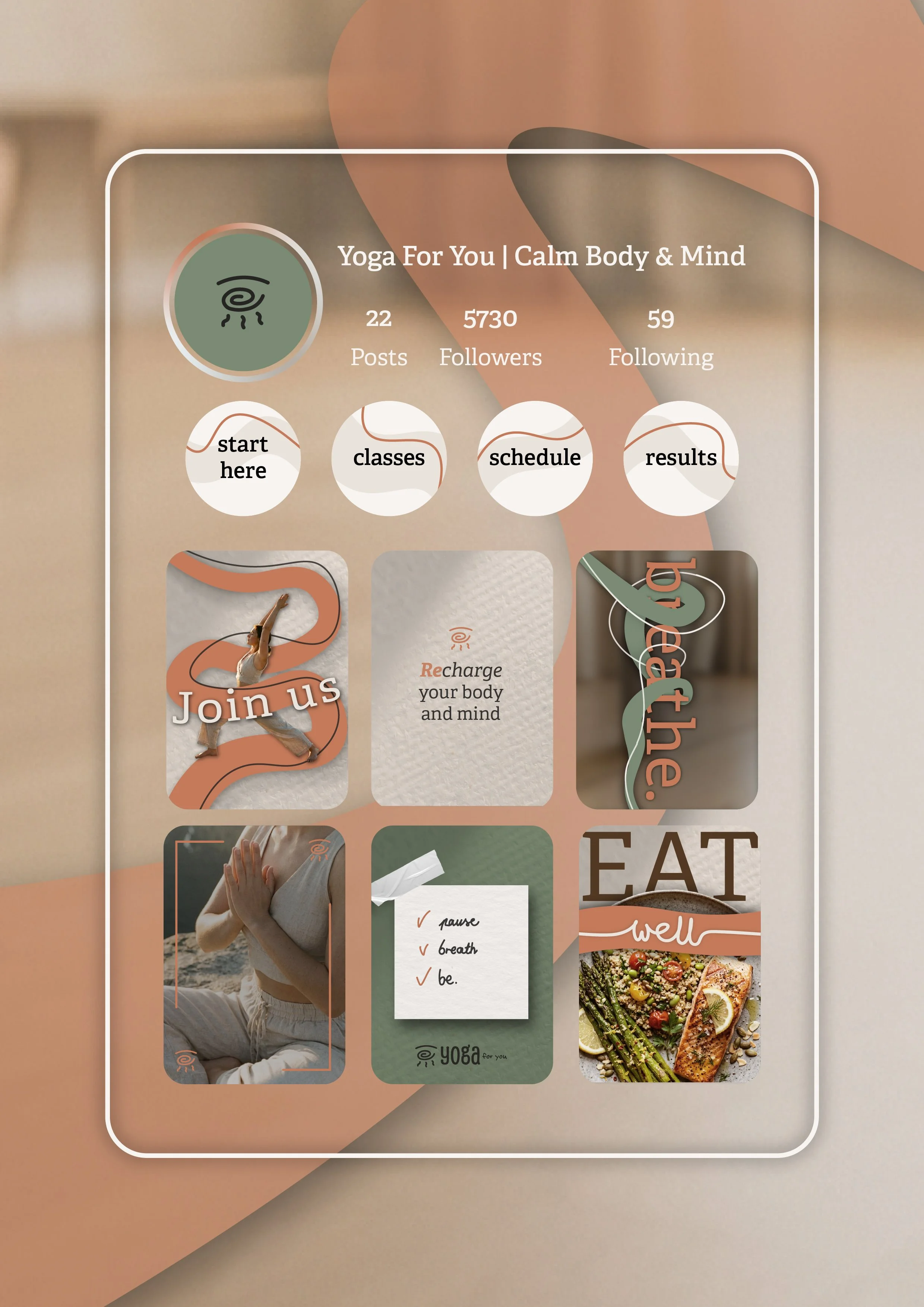
The final identity feels cohesive and inviting.
It creates a sense of trust, making the brand feel approachable for both beginners and more experienced clients.
Instead of trying to stand out through complexity, Yoga for you stands out through clarity and emotional connection.
Because strong brands aren’t just beautiful, they feel right.
OUTCOME
OUTCOME
The final identity feels cohesive and inviting.
It creates a sense of trust, making the brand feel approachable for both beginners and more experienced clients.
Instead of trying to stand out through complexity, Yoga for you stands out through clarity and emotional connection.

This project reflects my approach to branding: creating identities that are not only visually consistent, but also aligned with how the brand wants people to feel.
Because strong brands aren’t just beautiful, they feel right.
This project reflects my approach to branding: creating identities that are not only visually consistent, but also aligned with how the brand wants people to feel.